Continue to feel somewhat depressed. I think I need to do something to get whatever that's inside my mind out. The catch is, I don't know what's inside my mind. You know, the human brain is really amazing. It is has no idea at all what it contains. It knows what it supposed to do and not do it. Bloody amazing.
Ok, carry on.
This is part 2 of World Orchid Conference.
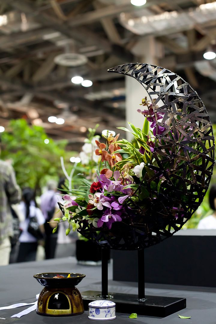
First of all, I love the display. It's the only one (among those from various schools) that stands out. Feels like some sort of altar, hahahaha! Anyway, I think I did correctly in term of balance. The bows to bottom right attracts some attention off the main display so it won't feel too static. However, I should try to crop out the people behind this. But then, I didn't really have that option because it was really crowded. The colour of the flowers and the reflection by the metal display saved this shot as it makes the display stand out.
I imagined what this shot would be like the instant I saw the pot of flowers. A lonely fallen flower at bottom left with all its commodes looking over it wondering who would suffer the same fate next. The two groups of flowers balanced one another out and the yellow among the purple creates some balance in colour.
The horizontal arrangement is to create movement of the eyes. The foreground red contrasts the background green to create some balance.
Don't know why I like this shot... Guess it's just unique? Can't really comment on it either...
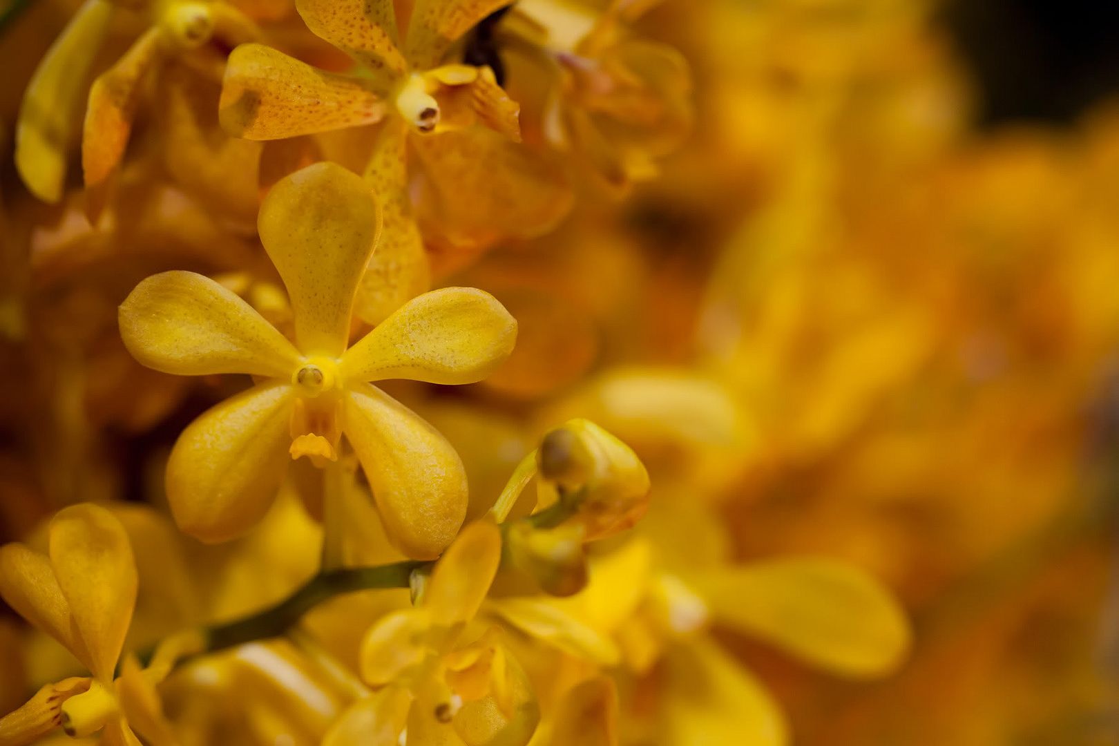
The brilliant yellow is the focus of this shot. I followed the rule of third and it seems to work here.
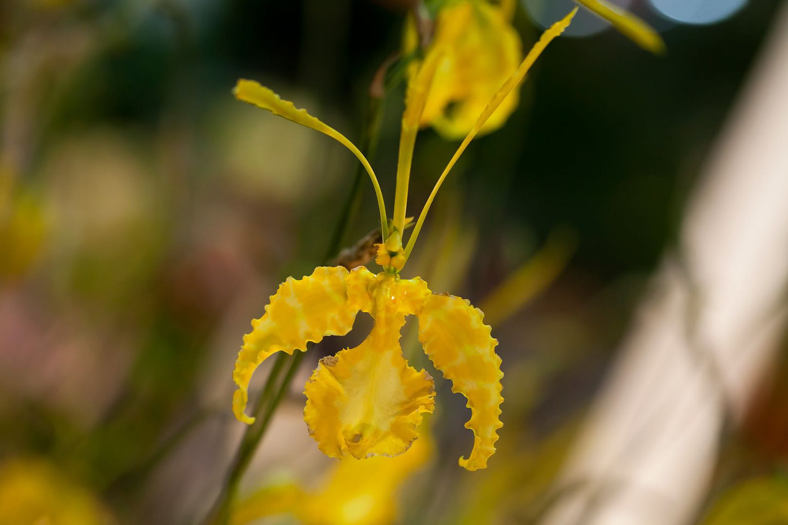
I like it because it looks like a claw... Anyway, I should have avoided the overlap with another flower at the top.
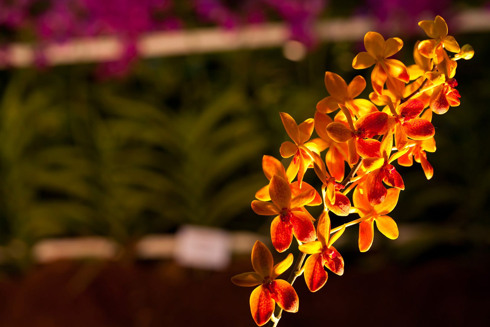
A example of great exhibition lighting. Next time when photographing flowers, one option is to lit them from the back to show the translucency.
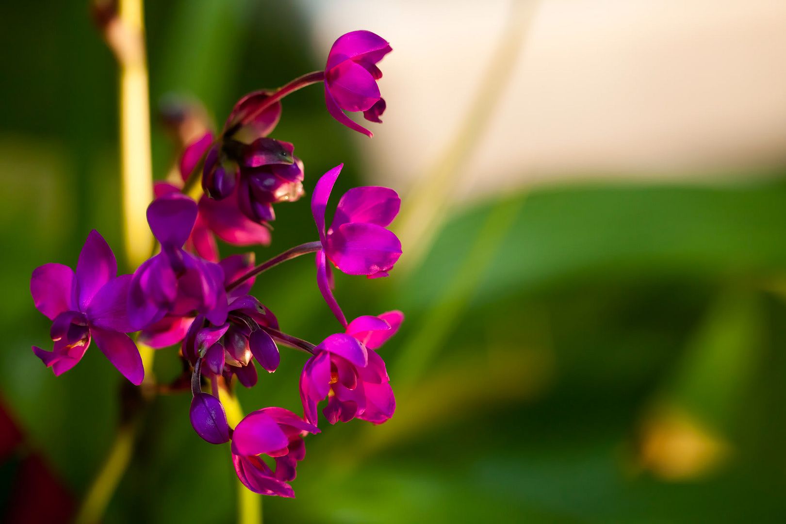
Another lighting that I really like. The row of flower behind provided some form of rhyme. However, I should have tried to keep the white line horizontal. The lighting made the flowers look as though they're on fire!
I honestly am not sure about this one. It's rather plain in my opinion. Should have made so the black line or that vertical line becomes straight. That should make the whole picture look more organized. Should have also cropped out the white spot at bottom left. Distracting.
Categories:
Life,
Photography

