Attended William's wedding and dinner banquet. They were fantastic! And I must mention that their wedding photos are splendid! Wish them happily ever after and looking forward to playing with their children! Hahahahahaha! A big thank you to Xinlian and William. It was really enjoyable.
However, after we bid one another goodbye, I sudden surge of loneliness hit me. It felt like all my hopes and ambitions being drawn out of me. I couldn't really keep track with the passage of time or take a proper photo. All the perceptive skills and composition skills seem gone and I can't even get a picture of anything properly. Is it because of the alcohol? Or is it the contrast between the festivity and the cold night sky? Or is it because I miss someone? Too many questions... Not enough answers...
Finally, part one of pictures from the World Orchid Conference. Enjoy! Usual rule applies, click to enlarge and feel free to use them. But please credit me somewhere. :) Oh, and I am testing displaying these pictures in xlarge instead of large in blogger. Wonder if it will lag out your browser... If it does, please feedback. Lol!

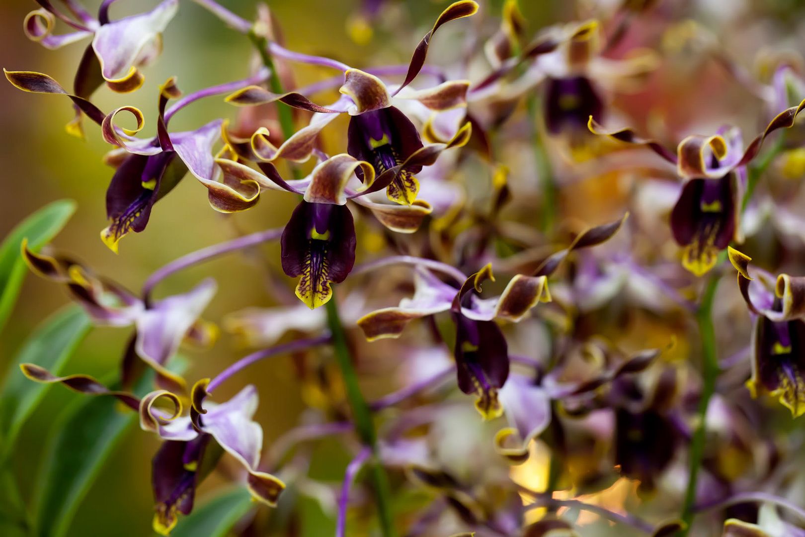
I really love the maroon of these orchids. I think I also did well on the composition by following rule of third. Balance is achieved as the gold medal below balance out the maroon flowers.
I like how the two large purple orchids stand out despite the messiness of the whole make up. Too much attention is concentrated on the left (due to the yellow orchid on top left) though. Should have tried to cut those few flowers out of the frame.
The colour here is perfect! Purple & yellow, complementary and harmonious. Though the composition is messy, I vaguely obeyed the rule of third and I find this arrangement pleasing to the eyes and not confusing. Guess I did it right?
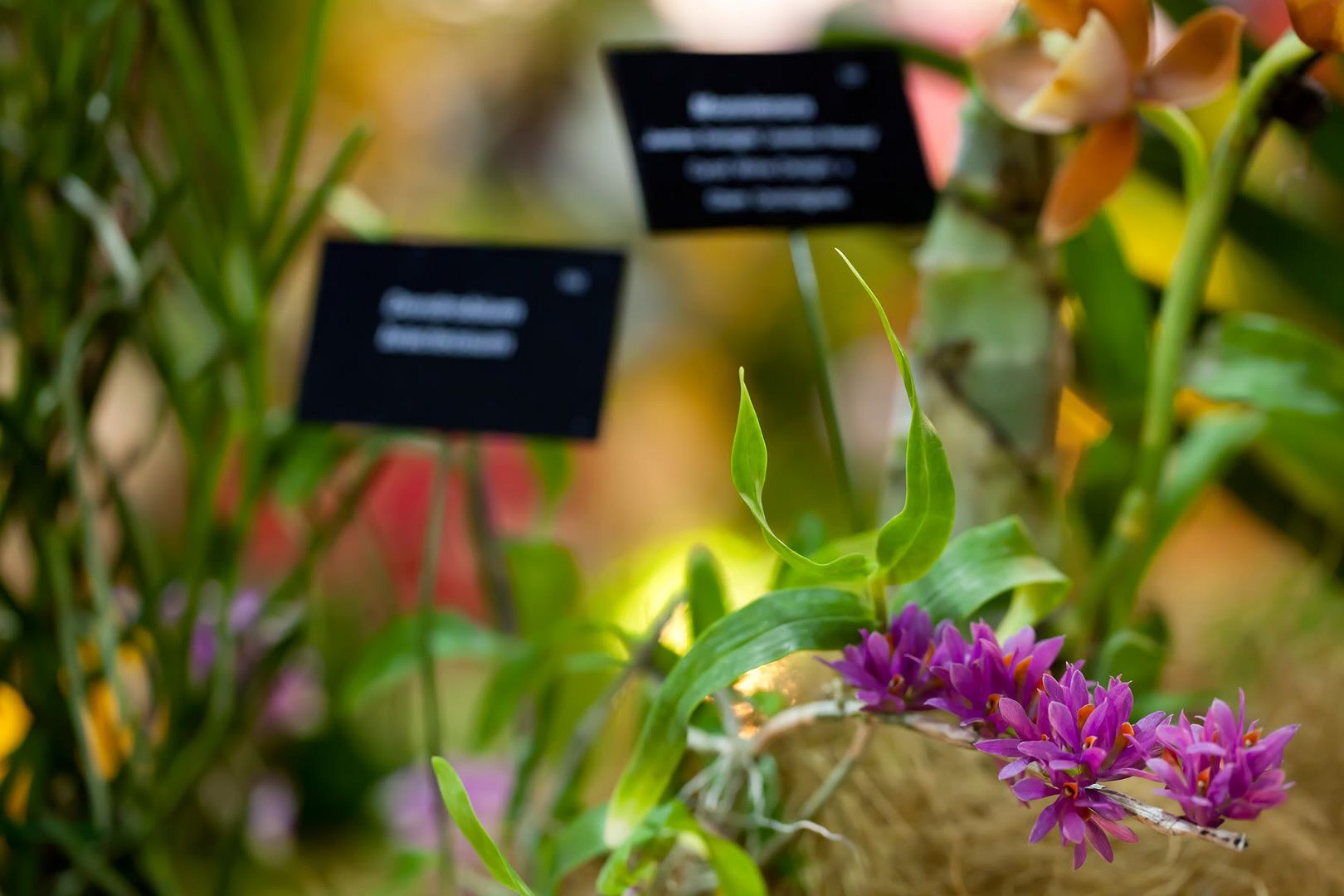
I guess flowers are very much about colours. Again, love the colour, orange + green. However, I dislike the composition. Shouldn't have focused at the centre and instead should focus on the flowers at the right. By obeying rule of third, I think this will become much more effective and balanced because the leaves to the extreme left are in sharp focus.
This could have been a great shot. But I screwed it up... Somewhat. The flowers in focus were placed too much to the right. I was trying to introduce diagonal eye movement from centre to bottom right. Instead, I left nearly nothing at the centre and viewer must painfully search for the point in focus. Bad!
I believe the display's lighting brought out most of the colour of these flowers. I realized that for flowers, side lighting from about 45 degree above or below really does the trick. It make the petals glow! Anyway, Continue to love the colour! Hahahahaha!
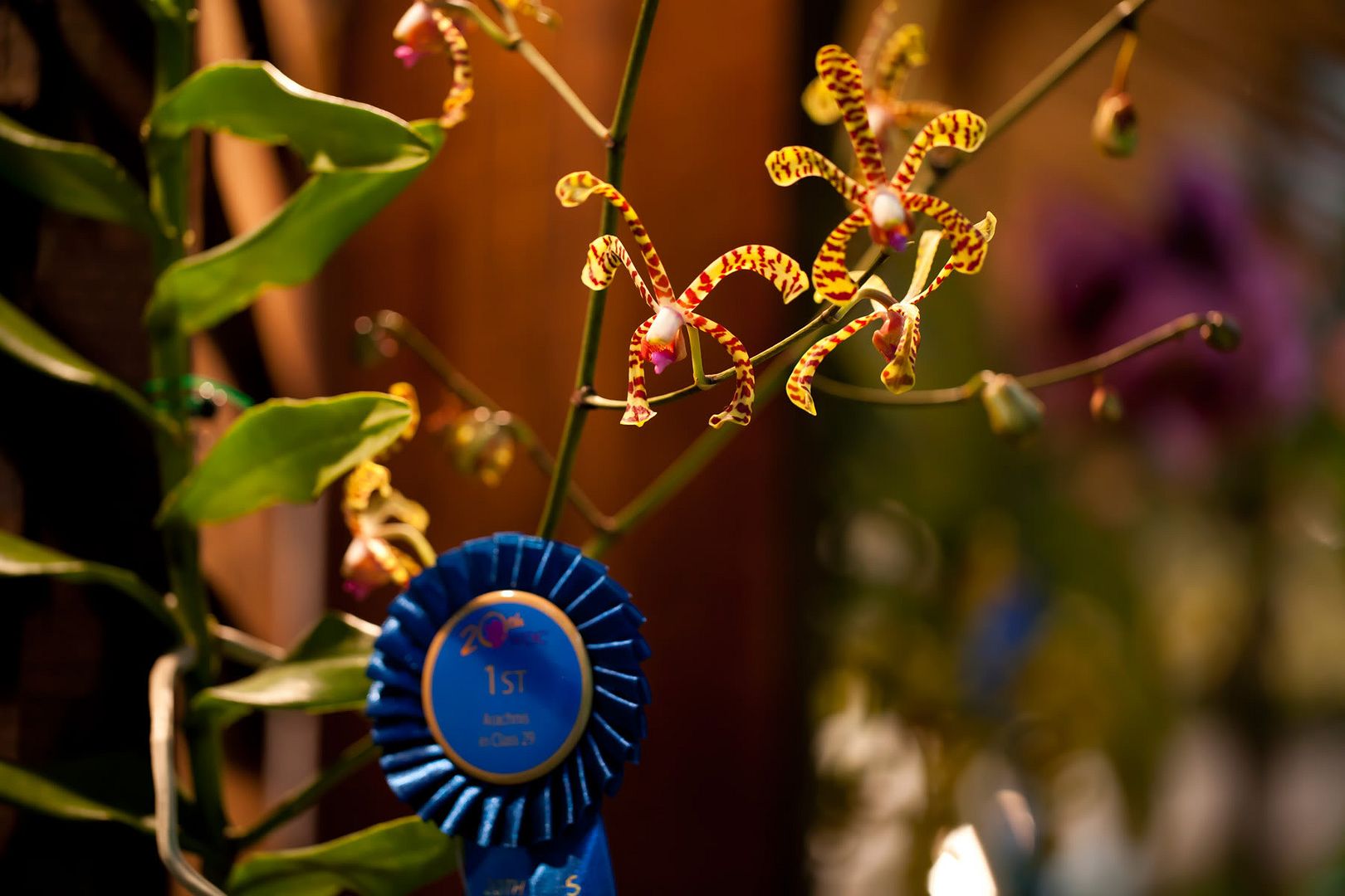
For this one, I just live the overall arrangement. The place where the flowers grow out and how the bottom half of the orchid plants seem to counter the flowers' "weight". Though I must express my utmost disappointment at the over exposed area on the top right. Shoul have tried to get it out of the frame as it is too bright, too distracting.
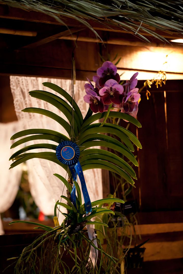
I believe I did well to balance the third position with the white flowers. They are both equally striking, positioned at polar opposite locations. I like them. And among all the orchid I saw, I like these ones the most.
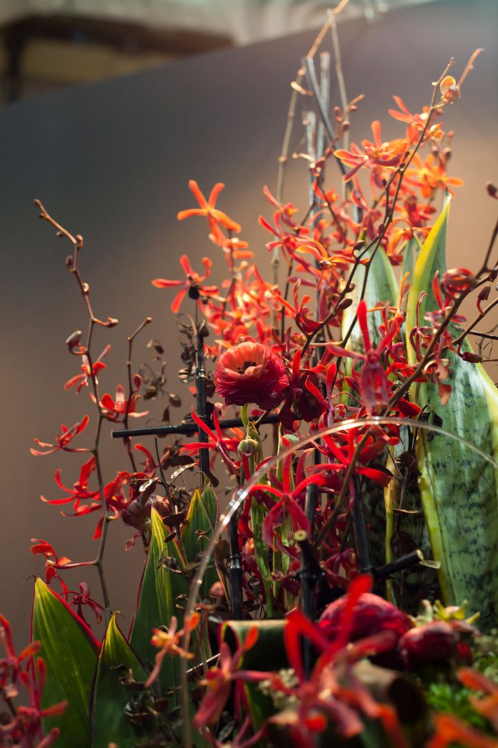
Didn't know why I like this. It's a balanced picture alright, I think the colour combination is good either. Red and green, conflicting but balanced. Hate the bit at top left that the background didn't cover... Though I managed to guide viewers' eyes out of there (at least I think I did), it's just imperfect... I think I like it because it reminds me of William's wedding.
Another picture in which I tried to play with balance. I guess I was moderately successful? Only arrived at that conclusion because I like this picture. Hahahahahaha!


